

About This Club
- What's new in this club
-
I have shared Patricia's profile shot before. It was in the club, if you look a few pages back. As for Freya: Go for it! It'd be cool to see your take on her. For her outfit, I just tried to draw based on an already existing anime character's nun outfit. With the addition of the white tufts and mistletoe (because...Christmas!). Um...this one's Briar. The one I drew in the picnic, and for Mother's Day. I drew her to illustrate tears of joy, because before this, the only thing I had to rely on to illustrate that was a gif of Rem crying.
-
God bless working spoilers xD I've seen these all before, love them. Patricia's portrait is my favorite one there and I don't remember if you actually posted that one before because you had a full body version that DID make it up to statuses in commemoration of the holiday in question. Ghost from the attic loos menacing but nobody with a smiling carbunble on top like that can be that bad xD I kinda wanna have a go at drawing that Christmas nun. IDK she just looks elegant and I actually have a bit of trouble when designing nun outfits that look good enough.... The last ummm.... let's see... Ramona, right? I wonder what the context of her crying is. I recall the scene of her fighting a spider that kept redoing its web.
-
An elf girl for St. Patrick's Day, Wretched Ghost of the Bloodshed, my Christmas nun Freya, and one of my OCs Briar shedding tears of joy.
-

A different kind of drawing than usual for me~
Sleepy replied to Sleepy's topic in Crayon Corner's Personal Projects
Slight edit but got rid of the puffed cheek effect. It looked ugly and I already don't have such a high regard for my face as it is xD I wish I could have given the drawing a normal smile but it kept looking like fish lips after many tries, that's why it has that sort of expression ^^" Also, filled in a few white spots in the hair but as said above, it does lack some high lights for extra volume and quite frankly I'm not really sure how to fix that.... I probably should look around for a kneaded eraser and see if it does something..... One more thing, I altered the neck a tiny little bit.... I confess I only wanted accuracy on the head and the original neck I only put there when I was dead half-asleep because it looked awkward as a floating head... I slightly fixed it xD For record, these modifications require me to take additional pics of my face for reference.... It is a bit awkward for me to stare at myself like that. -
A different kind of drawing than usual for me~
Sleepy replied to Sleepy's topic in Crayon Corner's Personal Projects
Thanks and will do xD Really lost track of time ^^" -
A different kind of drawing than usual for me~
(o ×) replied to Sleepy's topic in Crayon Corner's Personal Projects
Woah. That's honestly incredible, considering what a departure it is from your typical style. I can't really think of any critique to give, the detail on this is amazing, that eyebrow holy shit. A lot of subtle work done through smudging alone. Also Jesus christ get some sleep. -
A different kind of drawing than usual for me~
Sleepy replied to Sleepy's topic in Crayon Corner's Personal Projects
Ah, I see what you mean. I am gonna try to at least get rid of the white pockets but otherwise yeah, not quite sure how to fix it. Trial and error I suppose haha xD Thank you = ) -
A different kind of drawing than usual for me~
Ash replied to Sleepy's topic in Crayon Corner's Personal Projects
Looks great, I guess my only suggestion would be to try and add depth to the hair although I'm not sure how you'd go about doing it (a light shade maybe?) Right now the hair goes into nothing so looks like they're missing half their head lol -
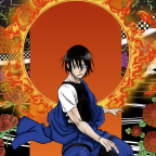
Ok sooo umm... This is something I have wanted to try out for a long time but it's definitely not my style or strength at all... Even knowing my limitations it still surprises me that I've been working 4 hours on it and now I have to wake up in like 2 more to go to work xD The hair was a nightmare and I swear I wasn't trying to do a duckface or anything, I wanted to make one of those cute angry anime expressions.
-
Thanks once again n.n The green extends underneath almost up to where the real black starts, then I blended from the black towards the girl 3 shades of gray. Was trying to make a brighter aura but when I realized the effect that was worming I ate up most of the green with grays and was like "this isn't exactly what I was planning.... but it's better xD "
-
[Drawing](in progress) Rock-themed monsters
Sleepy replied to Sleepy's topic in Crayon Corner's Personal Projects
Thank you = ) The marker's have a brush tip that helps a lot. The background has the marker strokes that visible because it is meant to have more layering going on. I get what you are saying with the digimon vibes xD -
[Drawing](in progress) Rock-themed monsters
(o ×) replied to Sleepy's topic in Crayon Corner's Personal Projects
Getting digimon vibes from this, if it makes any sense. Love the way you did the smoke, you have crazy talent with a felt-tip marker. Such a distinctive style. -
I really like the subtle use of green in the glow around the subject, it gives it a really neat eerie feel
-
[Drawing](in progress) Rock-themed monsters
Sleepy replied to Sleepy's topic in Crayon Corner's Personal Projects
Thank you xP To be fair I should have probably gone to the showcase section... -
[Drawing](in progress) Rock-themed monsters
LordCowCow replied to Sleepy's topic in Crayon Corner's Personal Projects
I need to think about changing how clubs function if only to make these more visible I love them btw -
So I have these in hopes I can make an archetype after I gather enough drawings. They are meant for card art and I pretend for the cards to be a gift for a member that I don't think look around in here very often xD The theme is FIRE Rocks and only have 2 so far. I was suggested that I should offset their colors from each other at the very least but like in all my drawings, I take suggestions and stuff here too... or in this case, ideas are welcomed xD
-
This was made for card art a week or so ago:
-
This was more of a request, although the character in question is mine. The girl is called Danika and I hadn't drawn her in a while tbh.
-
Tour Guide from the Underworld (Christmas) Drawing
Sleepy replied to Sleepy's topic in Crayon Corner's Personal Projects
Thanks xP Yeah, it's a weird aurora.... I've always struggled making auroras (not actually my first or second take on one xD ) I got the green I needed now, after this drawing was done.... maybe I can still apply it because it's a darker green but still thinking about it heh. -
Tour Guide from the Underworld (Christmas) Drawing
LordCowCow replied to Sleepy's topic in Crayon Corner's Personal Projects
omfg that's so cute the background is nice too, the uh....aurora? Though maybe cause you pointed it out now I can't stop thinking that there IS a little off with the color of the green, maybe the contrast with her hair? -
Made about a week ago for the sake of having something of the season in time xD I had no idea how to go about the background once I had the character made, so I kept adding violets, purples, blues, vaguely resembling a cave-like pattern and after enough time I grabbed a pen and have what you see here.... I think the green is a bit too light and lime-y but that's what you get when you YOLO it and hope it ends up well hahaha....
-
This is gonna keep progressing to completion, but not right now, it is 1:25 in the morning and I need some rest xD Here's what I have so far. Suggestions and comments would be a great help~
-
This is a sketching stage of what I wanna eventually use as header for the Club. Some feedback would be greatly appreciated.